Art Gallery App
Art gallery app helps visitors can plan trips, see current artwork collections, and buy tickets for themselves and loved ones.
Art gallery app helps visitors can plan trips, see current artwork collections, and buy tickets for themselves and loved ones.
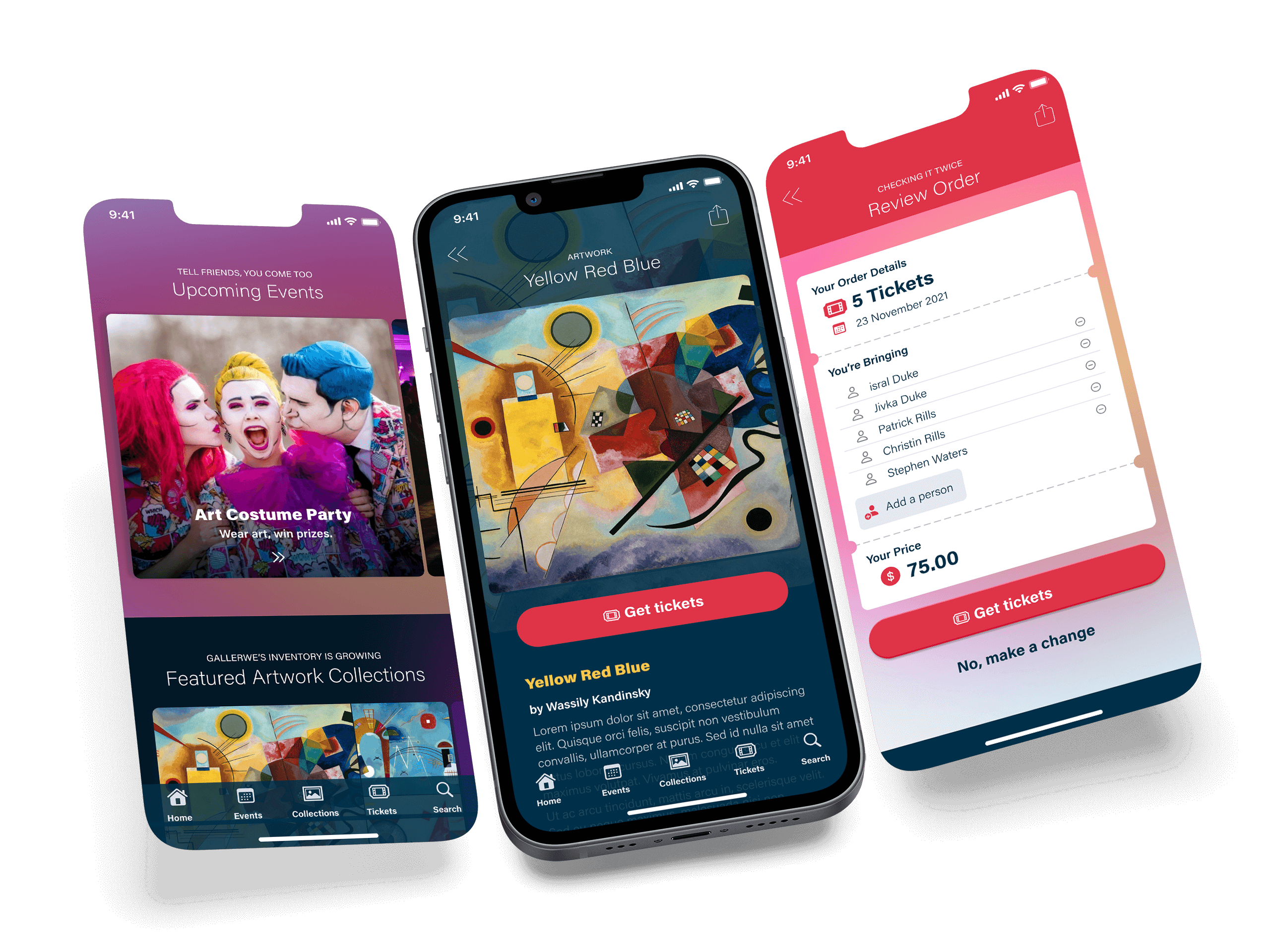

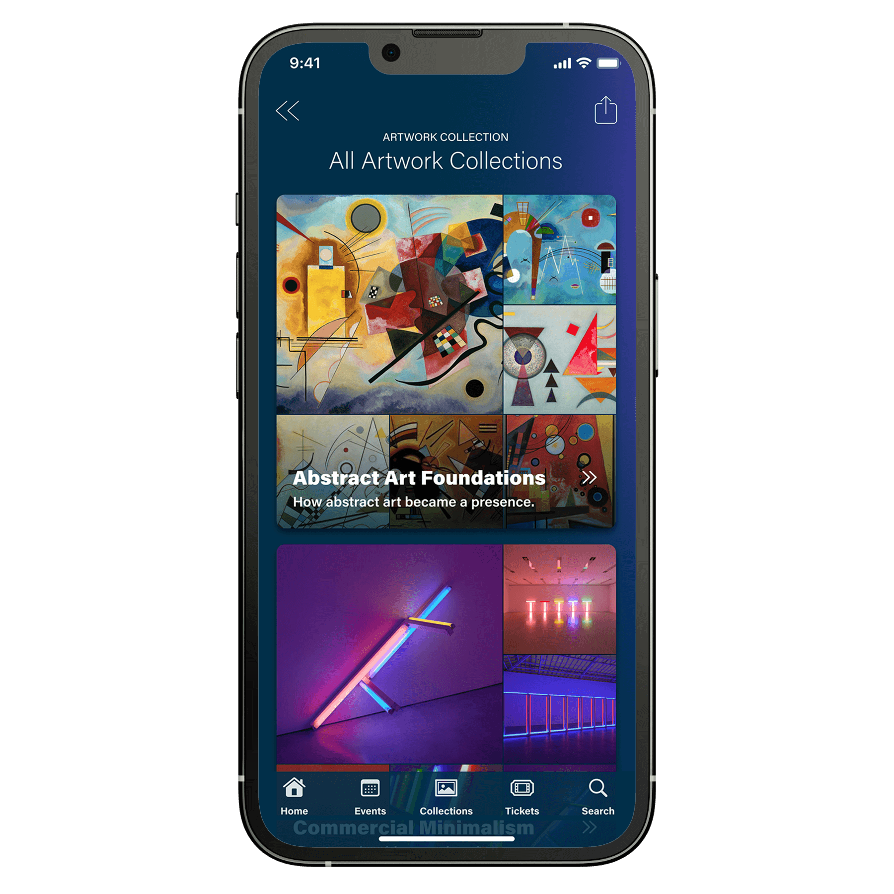
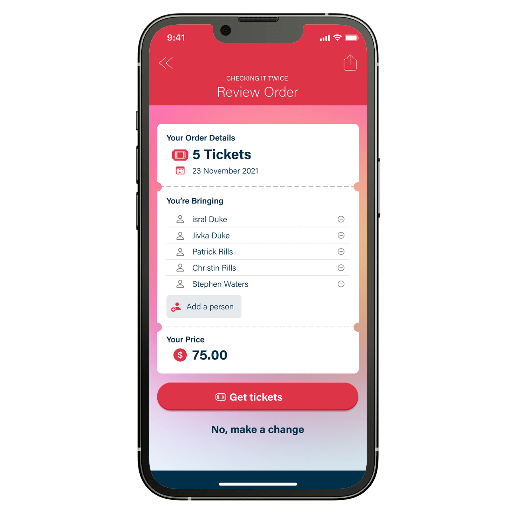
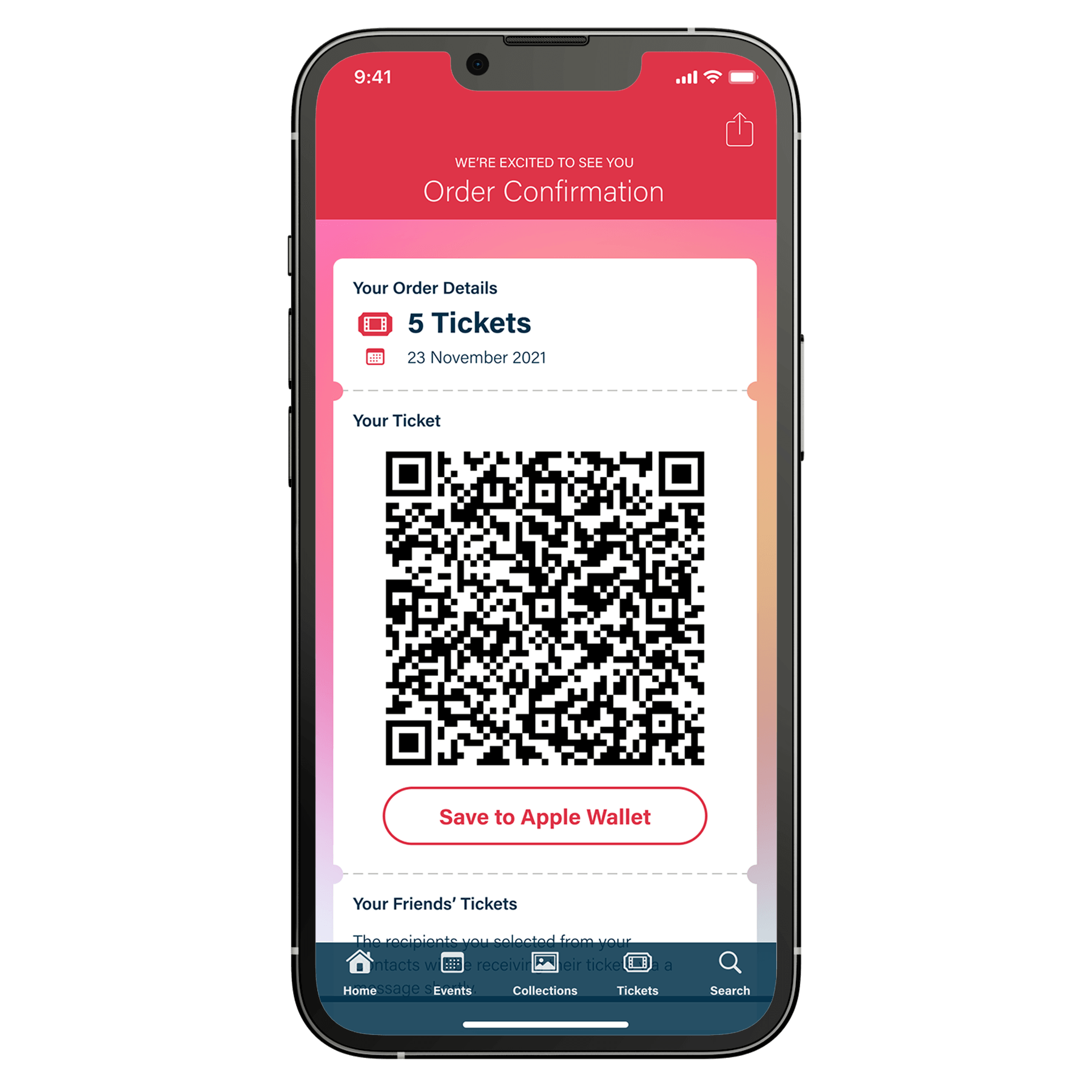
Create a brand new mobile experience for the gallery. Visitors can buy tickets, learn about upcoming gallery events, and plan their next visit.
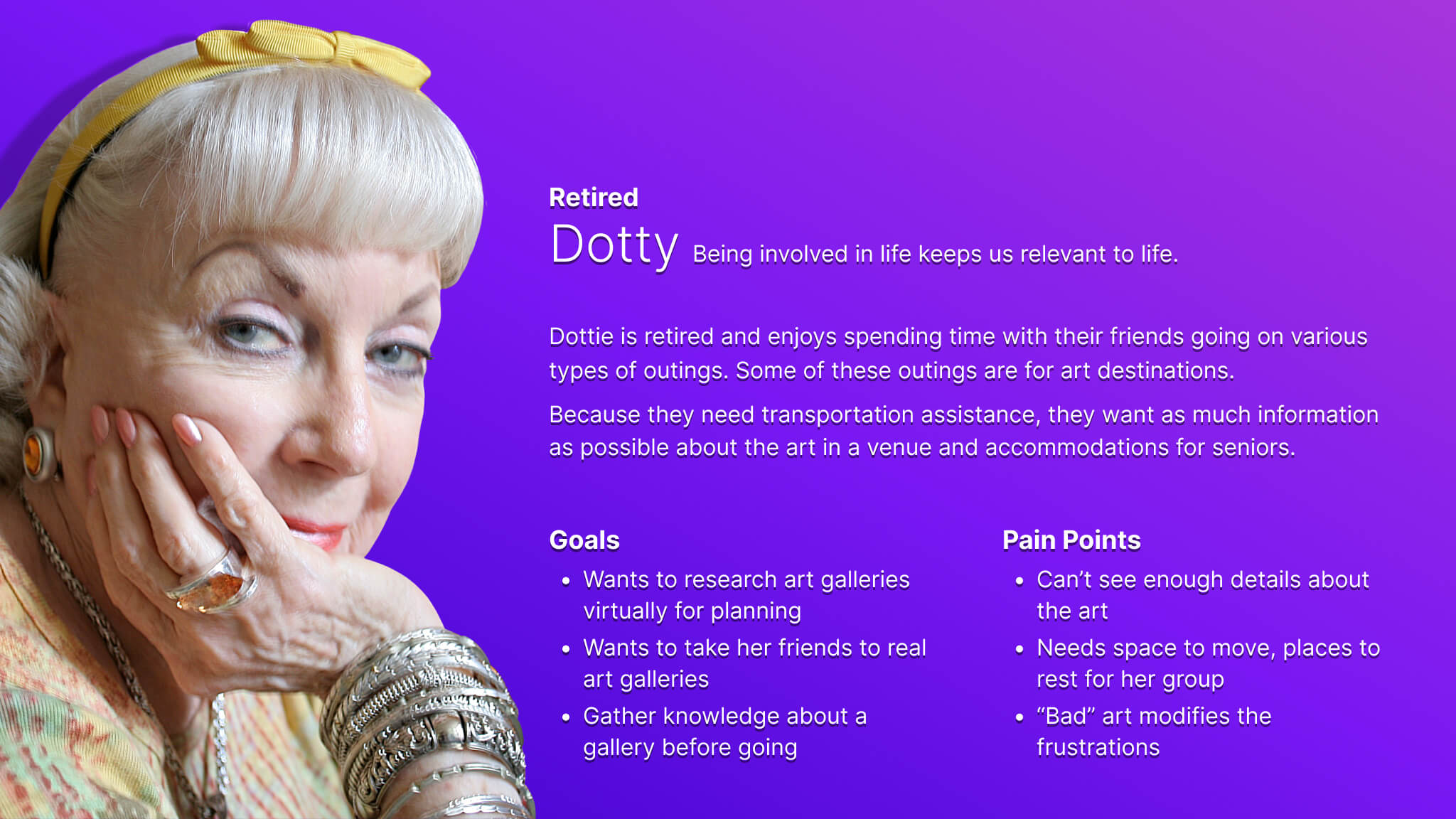
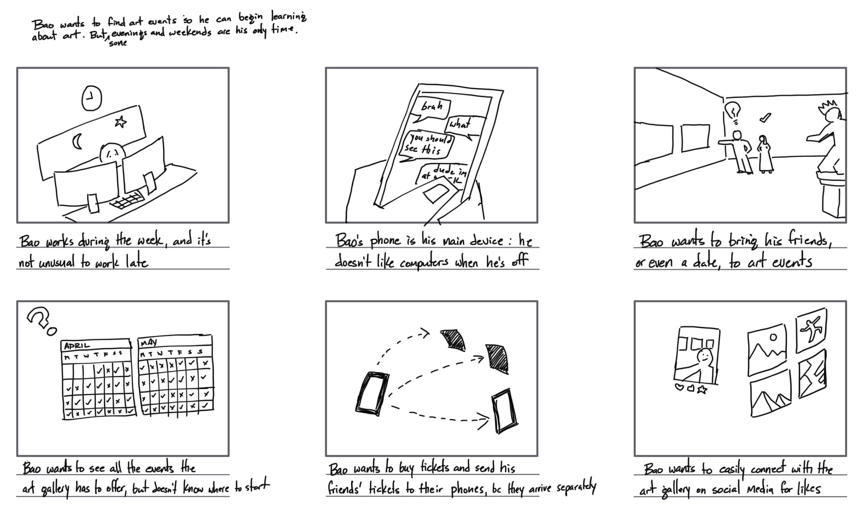
The target audience is two groups of people. The first group is made of retired, senior visitors who often rely on transportation services to go to the gallery. The second group is young professionals who want to plan evening and weekend outings at the gallery.


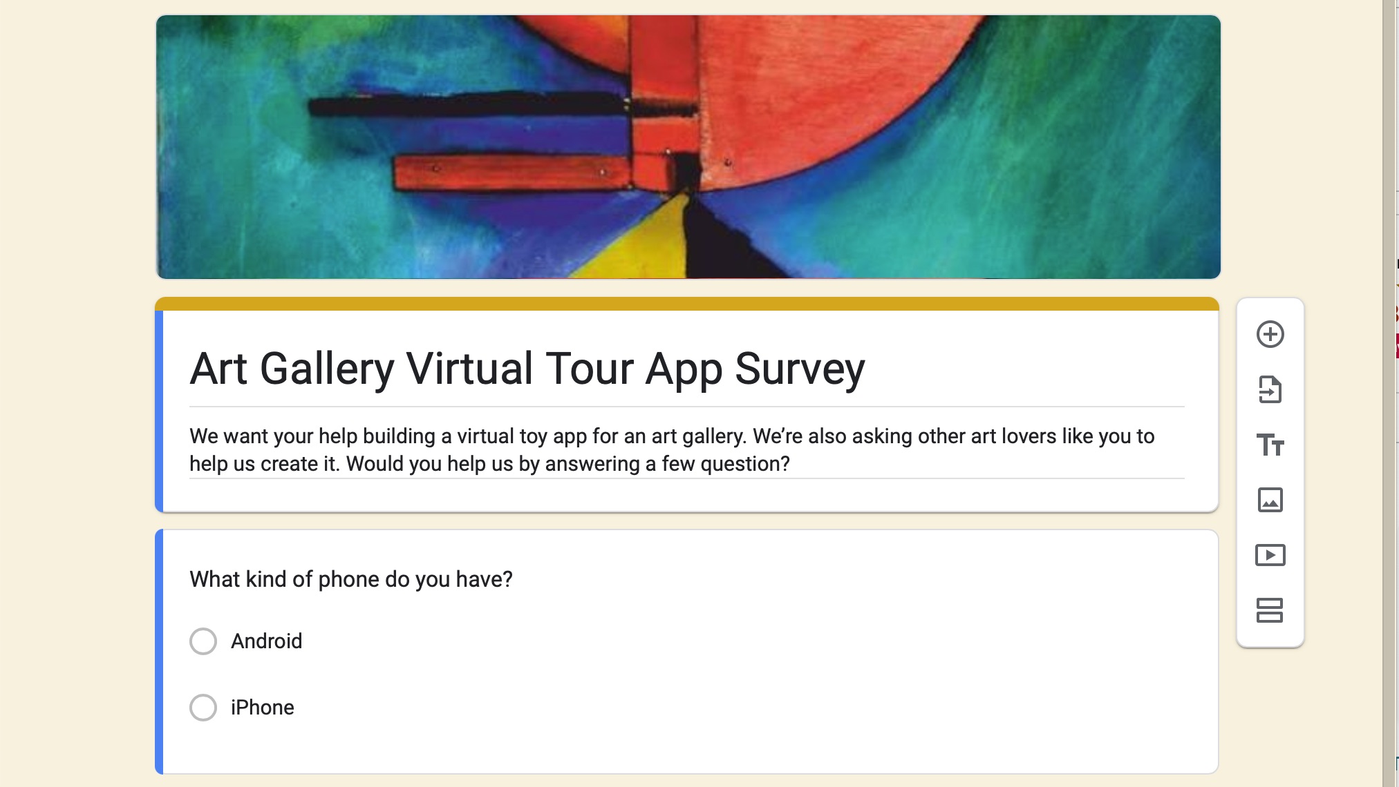
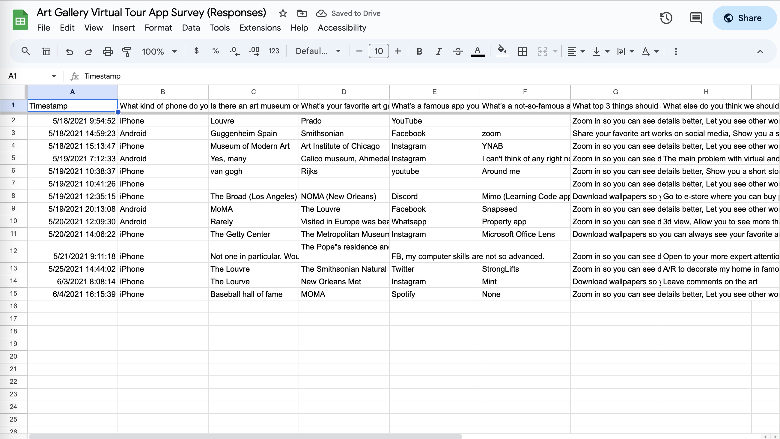
I used an online survey to determine the content people expect in an art gallery app and which art galleries came to mind for what I should consider. Participants were chosen from people who normally visit art galleries and art museums. I conducted in-person and remote interviews. The key challenges in the process was arranging for the in-person usability studies for the seniors who make up the first segment of the target audience. Segment two was comfortable with video interviews.

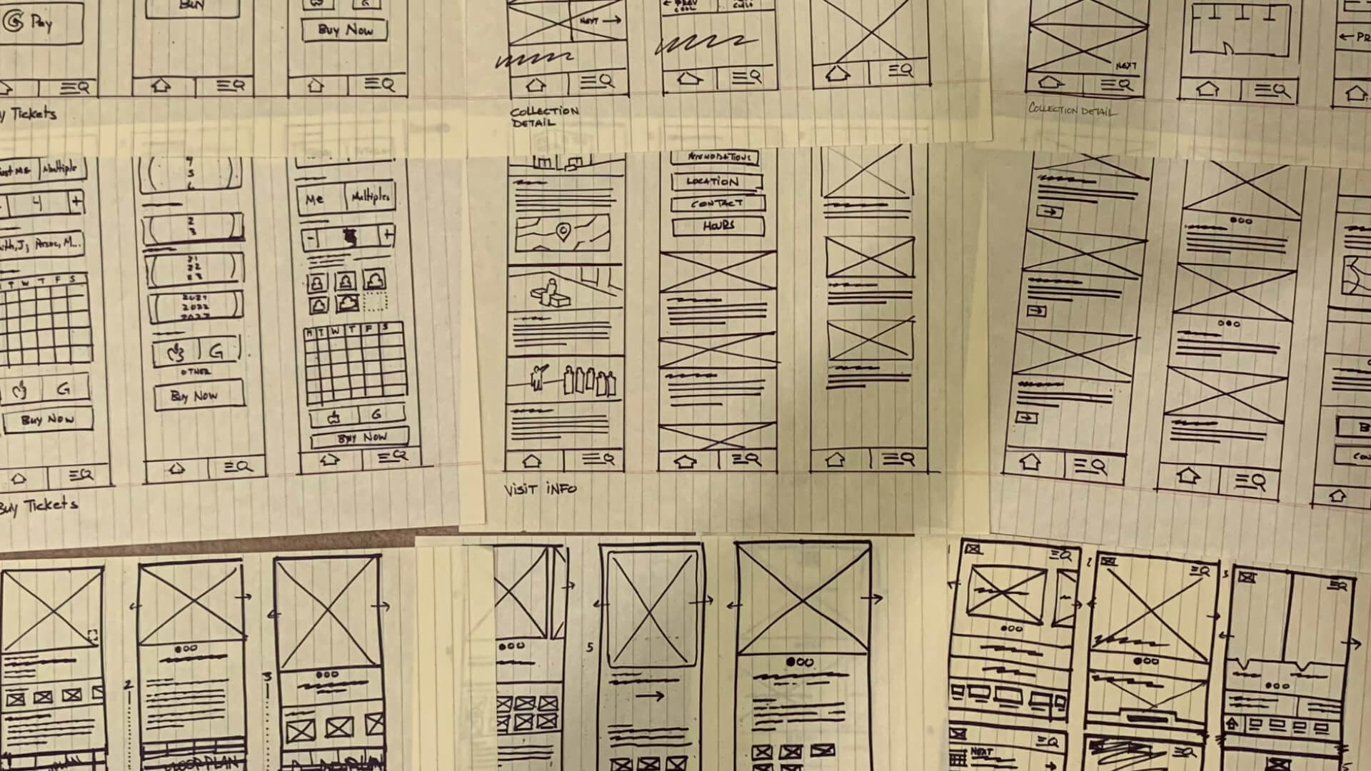
After thinking about the research I started creating hand-drawn wireframes using the Crazy 8s method. After selecting the most promising ideas, I created wireframes in Figma. The best ideas from initial design concepts were translated into digital wireframes.
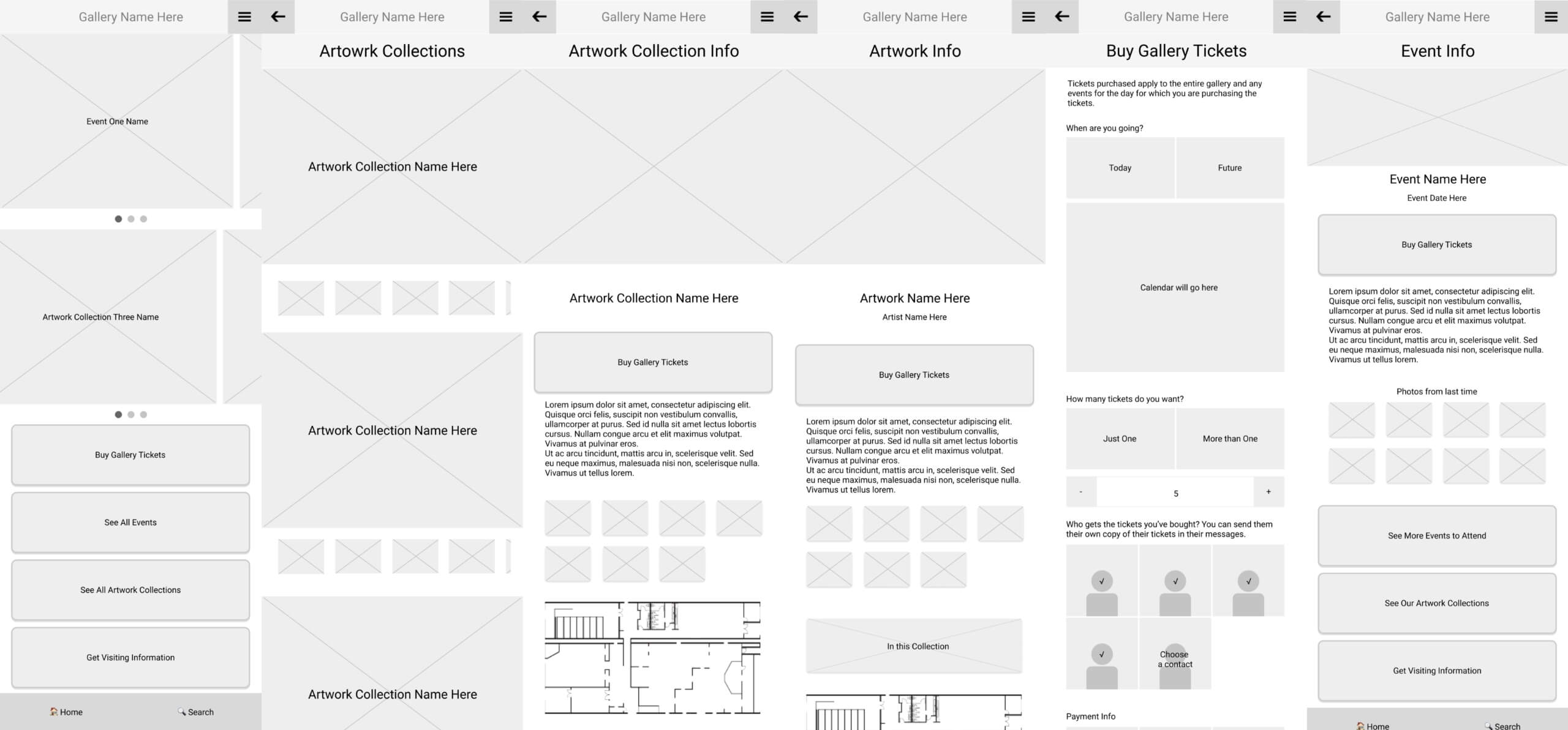
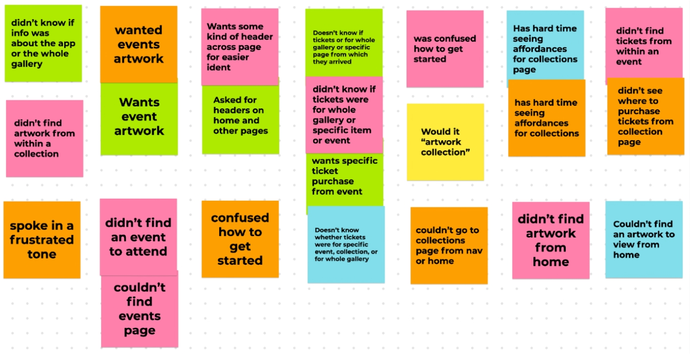
Participants reviewed the digital wireframes and answered questions about navigation, expectations, and preferences. Their feedback became usability testing data and recorded in a spreadsheet for each participant. Those responses became affinity groups. The usability work informed the final design.

The art gallery mobile app’s design is fun, richly-hued with saturated colors, and provokes curiosity by using bold visual design choices. Other art gallery apps I reviewed were a little stiff and “elite” so I chose saturated, exuberant colors in the visual design. However, I was more restrained in the ticket purchase screens.